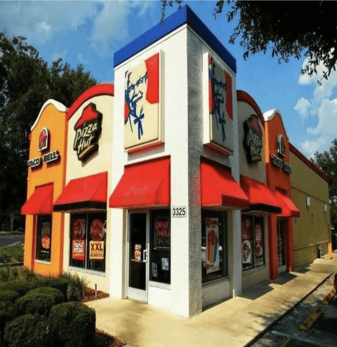

People can't always name what they're seeing, but they feel it — and an organization that feels inconsistent is harder to trust.
That's brand inconsistency. It's one of the most common problems growing organizations run into, and it almost always traces to the same root: you have brand elements, but not a brand system tying them together.
What brand inconsistency actually feels like
It rarely looks like an obvious mistake. It's quieter than that. The logo shows up in three slightly different colors depending on who exported the file. The website uses one set of fonts and the brochure uses another. The photography swings from clean studio shots to blurry event snapshots, sometimes on the same page. Presentations look like they were built by different companies in different decades. A "fresh" social graphic somehow looks nothing like the website.
None of these is a catastrophe alone. Together they wear down something that matters: the sense that your organization is coherent, intentional, and trustworthy. People can't always name what they're seeing, but they feel it, and an organization that feels inconsistent is harder to trust.
Why it happens
Brand inconsistency is almost never carelessness. It's what happens when an organization grows faster than its brand infrastructure.
You made a logo. Then you needed a website, so someone built one. Then social graphics, made by someone else. Then an event needed printed materials and the vendor used their own templates. Then a new hire started producing content in whatever tool they knew. Then a contractor ran some digital ads with assets they sourced themselves. None of those calls was wrong on its own. They just accumulated, until the brand became an archaeology of every vendor, volunteer, and deadline that ever touched it.
The problem was never the people. They just never had one shared source of truth.
The fix: a visual identity system
A visual identity system is the documented set of decisions that governs how your brand is expressed everywhere. It's more than a logo package. It's the infrastructure that makes consistent output possible even when different people are making materials in different contexts. (For the full anatomy of one, see our guide to what a visual identity system includes.)
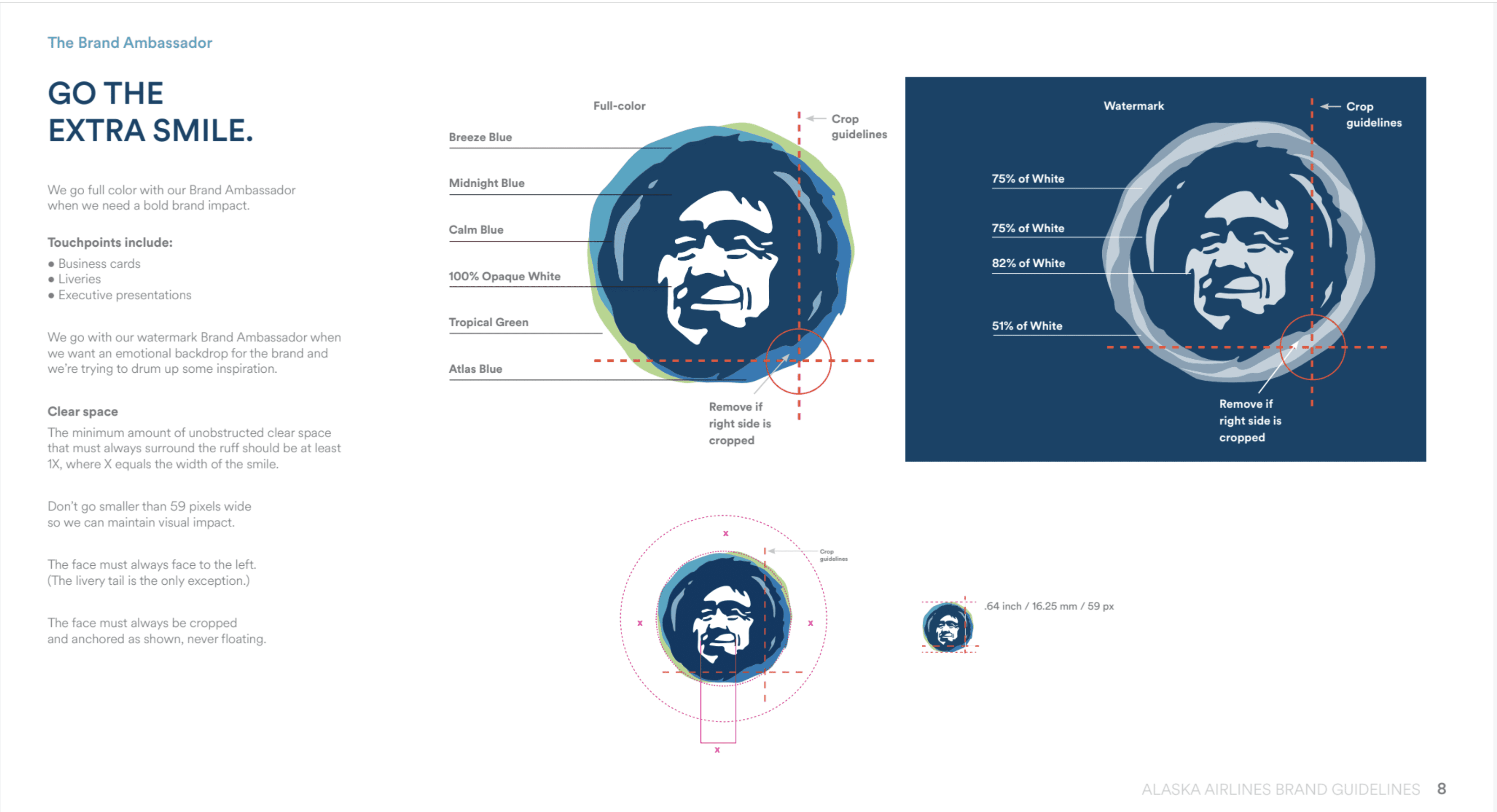
The short version: it covers the core identity elements (logo and approved variants, the full color palette with digital and print values, the type system, and any supporting graphic elements), the usage guidelines that say how those elements get applied and what the brand should never look like, a defined photography and imagery direction, ready-made templates for the materials you produce over and over, and one central library where every authorized file lives. When all of that exists and is written down, consistency becomes the path of least resistance. People stop inventing and start applying.
What changes when the system exists
Production gets faster, because the decisions are already made and no one starts from a blank page. The quality floor rises, so even materials made by non-designers working from templates come out coherent. Everyone — staff, vendors, partners — knows what to use and how, so "is this on-brand?" becomes an easy question to answer. And your audience encounters a brand that reads as one thing, which is part of how an organization signals maturity and care without saying a word about it.
How to know you need one
A few signals are reliable. You wince when you see your own brand applied badly. You can't point a new team member to a single authoritative source for brand assets. Different people produce different-looking materials with no clear standard. You're heading into a launch, an expansion, or a real visibility milestone. Or you've simply outgrown the current brand and you're ready to invest in the next chapter.

If your identity elements are sound and only the system is missing, documentation and templates may be all you need. If the identity itself is the problem — the logo, colors, and type aren't working together or no longer reflect who you are — then a refresh or a full identity project is the better starting point.
A note for faith-based and mission-driven organizations
For an organization whose credibility is bound up with its mission, inconsistency costs more. When a church, nonprofit, or ministry looks disorganized, even only visually, it quietly raises a question about its capacity to steward the trust people are placing in it. For organizations that care about substance, design isn't a vanity expense. It's a form of stewardship: of your message, your mission, and the people you're asking to engage with both. A visual identity system is how you make sure the way you show up is worthy of what you're about.
At Horsfall Design Co., we build visual identity systems for purpose-led organizations ready to show up with the clarity their mission deserves. Book a Fit Check to talk about where to start.
To learn more about branding, checkout our post on: What Is a Visual Identity System? A Guide for Mission-Driven Organizations

Let’s keep in touch.
Discover more about high-performance web design. Follow us on Twitter and Instagram.

